Pro Volleyball Federation
Launched in 2024, The Pro Volleyball Federation (PVF) is a professional women's volleyball league in the United States
The objective was to market the PVF games on Roku Sports Channel.
Design Execution
Reflections
While PVF did not specifically list ‘women empowerment’ as a point to hit, I personally wanted it to be the foundation of my design decision. Women sports such as the WNBA are on the rise. I wanted to make sure I do my best to utilize our designs to elevate PVF. For future iterations, I would push to showcase the athletes as opposed to the PVF branding. After all, the athletes will be the primary source in capturing the audience and in doing so elevate the PVF brand as well.
Disclaimer:
This case study was created solely for portfolio purposes to showcase my design process and contributions. Thoughts and notes are my own and not reflective of Roku. All visuals, logos, and assets are the property of Roku and MLB.
Ideation
When we reviewed the promotional videos provided by PVF, the athletes had a special intro. In the background I noticed a lot of neon lights, fog and topography. I wanted to capture that essence so I set out to look for texture images that would reflect that into the design.
Reference
After reviewing the video and image assets provided by PVF, I knew it’s a league where the athletes demand respect while having fun doing so. I knew I had to capture the vibe and energy that these athletes demonstrate within our designs.
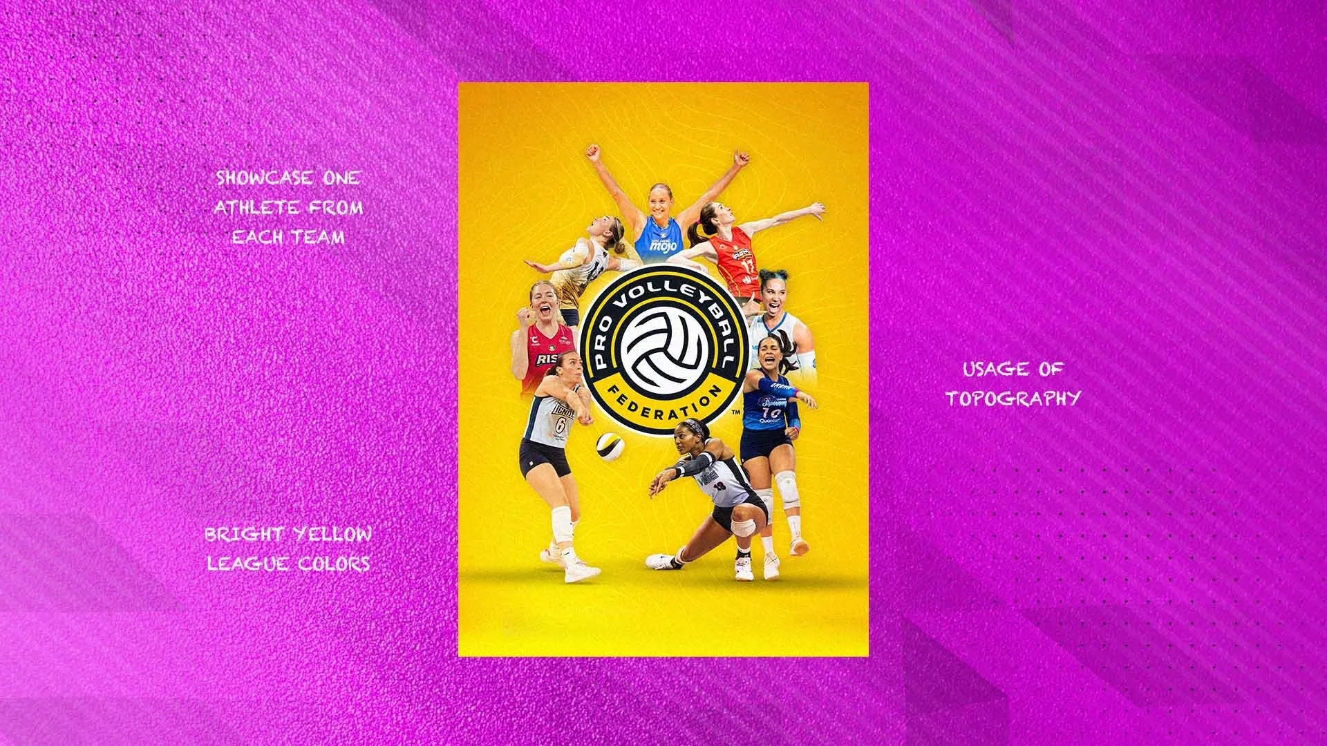
Final
I provided two design concepts which was well received by stakeholders. They loved the energy and how the athletes were laid out on the design. Personally I felt the design hit the points I initially set out to achieve: energy, movement, and empowerment.